Giving Text the Wraparound
Jealous of print designers being able to create page layouts with text beautifully flowing around images? Our (web people) time has finally come.
 For some time now a CSS feature - CSS Shapes - has been making its way into the CSS specification drafts and even into some browsers as an experimental feature.
I'm not a fan of using experimental features or even those that have just standardised in live websites - it will take a while to filter down to the userbase.
Just the other day I went to a site and the splash-screen told me I needed to update my browser to be sure of seeing the content - I was using a week-old release Firefox. The site was for a UX designer...
Happily though, all the major browsers have supported CSS Shapes for a while now, which in my view makes them safe to use.
Why Use It
All HTML elements sit within an invisible rectangular box. You can put them side by side, stack them and adjust padding and margin. Even a circle, whether an image (event a transparent .png or .svg) or a DIV with border radius, sits within a rectangular box.
CSS shapes frees us from these constraints and allows us to set wrapping points within an element so that neigbouring elements can flow in and around these invisible points.
There are various geometric shapes available like circle (as used with these balls) and ellipse but polygon is the most interesting. We can set as many points as we want to create an irregular wrap-around. There are two options available. One is to manually work out the points and set the coordinates ourselves, and the other is to use a mask image.
You don't even need an image to wrap text around - you can use :before psuedo elements on your main element (eg. text paragraph) to create invisible shapes to flow the text around.
Setting Polygon Points
Add the shape-outside property to the image (or :before element) that the text will wrap around:
shape-outside: polygon(X Y, X Y, ...);
shape-margin: 25px;- The first point is the top left and it works clockwise around the shape
- You can use pixel values or better still % values
- This creates a closed path so the last point joins the first one
- You need at least 3 points
- The element needs to be floated
 Two Margins
There is also a shape-margin property which sets how far from the wrap points text can be. This margin follows the contours of the points. You may need to also set the regular box margins as you normally would as wrap points don't extend beyond the element.
So in this example, there is a normal right margin set so that the ground to the right of the tower - which is on the very edge of the element - is not butting up against the text. Tip: I found it easier to set this margin first and then set the shape-margin.
Useful on Mobile
This feature is particularly useful on mobile where space is limited. You'll notice that as the text wraps tightly to the image, not only does it look more pleasing but the text is a line or two shorter.
On a mobile screen with several of these, this will help us to prevent the page from becoming too long and therefore save a lot of scrolling.
Speaking of mobile and responsive design, because we've specified the points as percentages rather than pixels, the wrapping points will perfectly scale when the image does.
Beware of Repositioning
However, if you relatively position the image like I've done - I set a negative left margin to pull the image off the screen - the wrapping points don't appear to move quite in-line with it.
This means that if we were to reposition the image for mobile, we would have to work out all the points again.
Point to Point
Creating the points seems like a nightmare? Firefox developer tools has a handy polygon editor built in! Just copy and paste the resulting coordinates into your CSS file.

Using a Mask Image
An easier method than defining polygon points is to create a mask image and use that instead to wrap text around.
shape-outside: url(images/mask.png);
shape-margin: 25px;
shape-image-threshold: 0;- Doesn't work locally on Chrome because of CORS (Firefox is OK)
- Another image for the browser to load
- Larger images/masks can cause a visible delay before text wraps
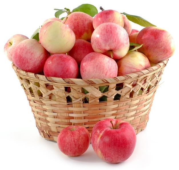
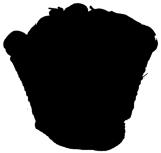
 The mask image (right) is quite simple to make. A .png with a transparent bg and a black outline where the text will wrap. Can be just 2 colours (this apples mask image is just 4k in size, the full .jpg is 59k).
 Overall this is probably a quicker method to develop as it is likely that you would be editing the main image anyway so creating a mask will be easy. You also don't have to worry about providing a new set of coordinates if you reposition the image.
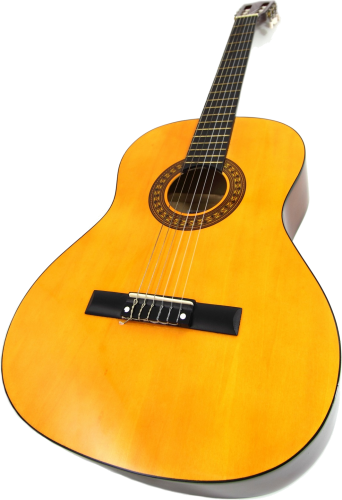
Note that if the image you are using already has a transparent background then you don't actually need a separate mask image - just specify the same image in the shape-outside. The guitar at the top of the page uses this. As always of course, watch the size of your .png file and provide smaller ones for mobile users if appropriate (deliver using src-set or Javascript image replacement).
Image-threshold sets what level of transparency to use as the shape outline with 0 being only fully transparent pixels (default) and 1 being everything. This is useful if you have a semi-transparent edge within an image that you want the text to wrap to.
Good Support
The only major browsers that don't support CSS Shapes are IE and Edge (all versions), and Safari IOS below version 10.3 will need a -webkit- prefix. The great thing is that unsupported browsers will still just wrap the text around the rectangular container anyway.